One symbol for the whole brand
The final mark joins the figure and the circle into one symbol, shown here on Pyrkia’s website.
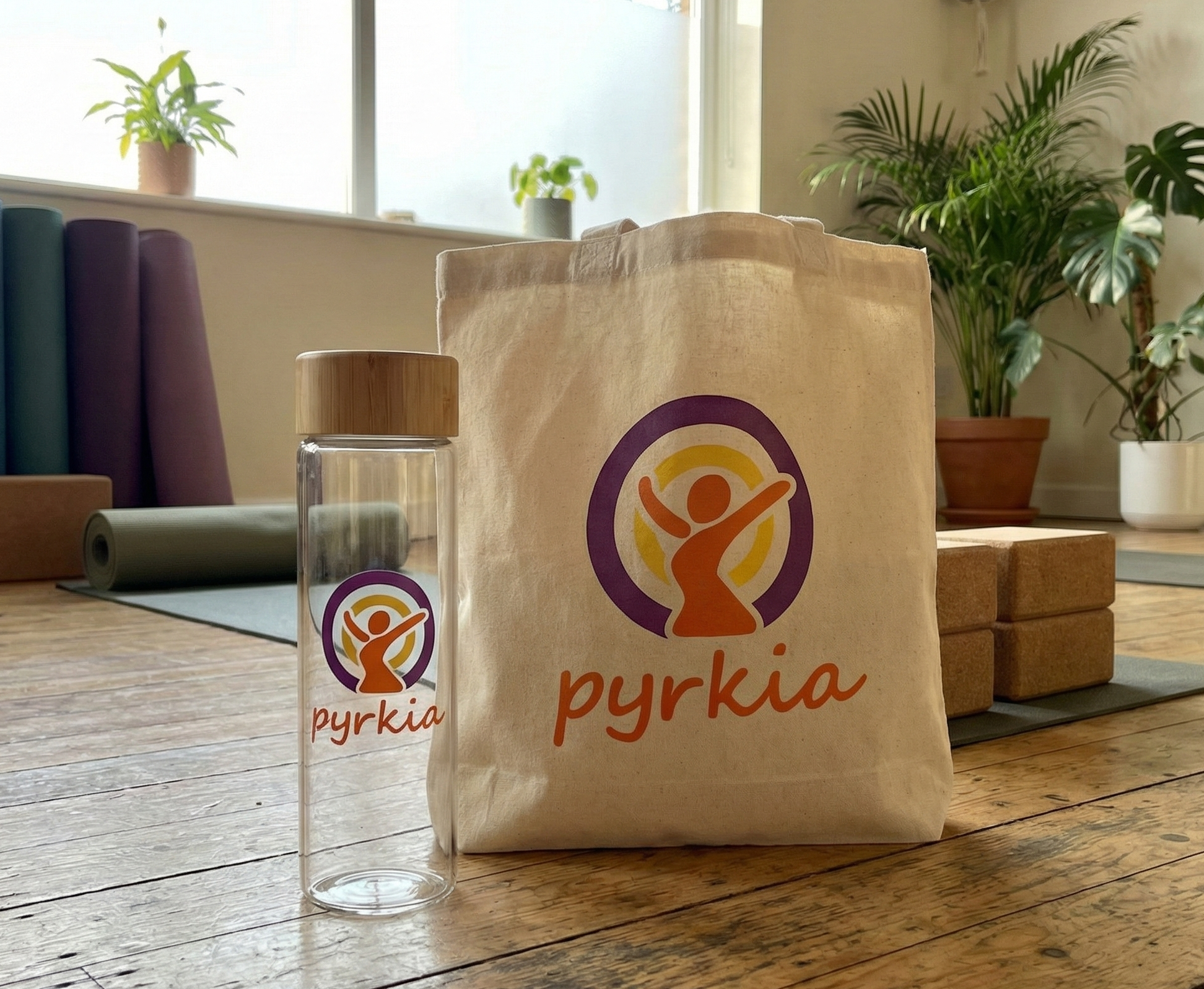
Pyrkia Health Services is a nature-focused wellness program. Its aim is to connect physical health with the natural world and with a sense of unity between a person and their surroundings.

Health and wellness branding is crowded with generic imagery. The client wanted a mark that read as care and unity, felt organic and human, and avoided the usual medical clichés.
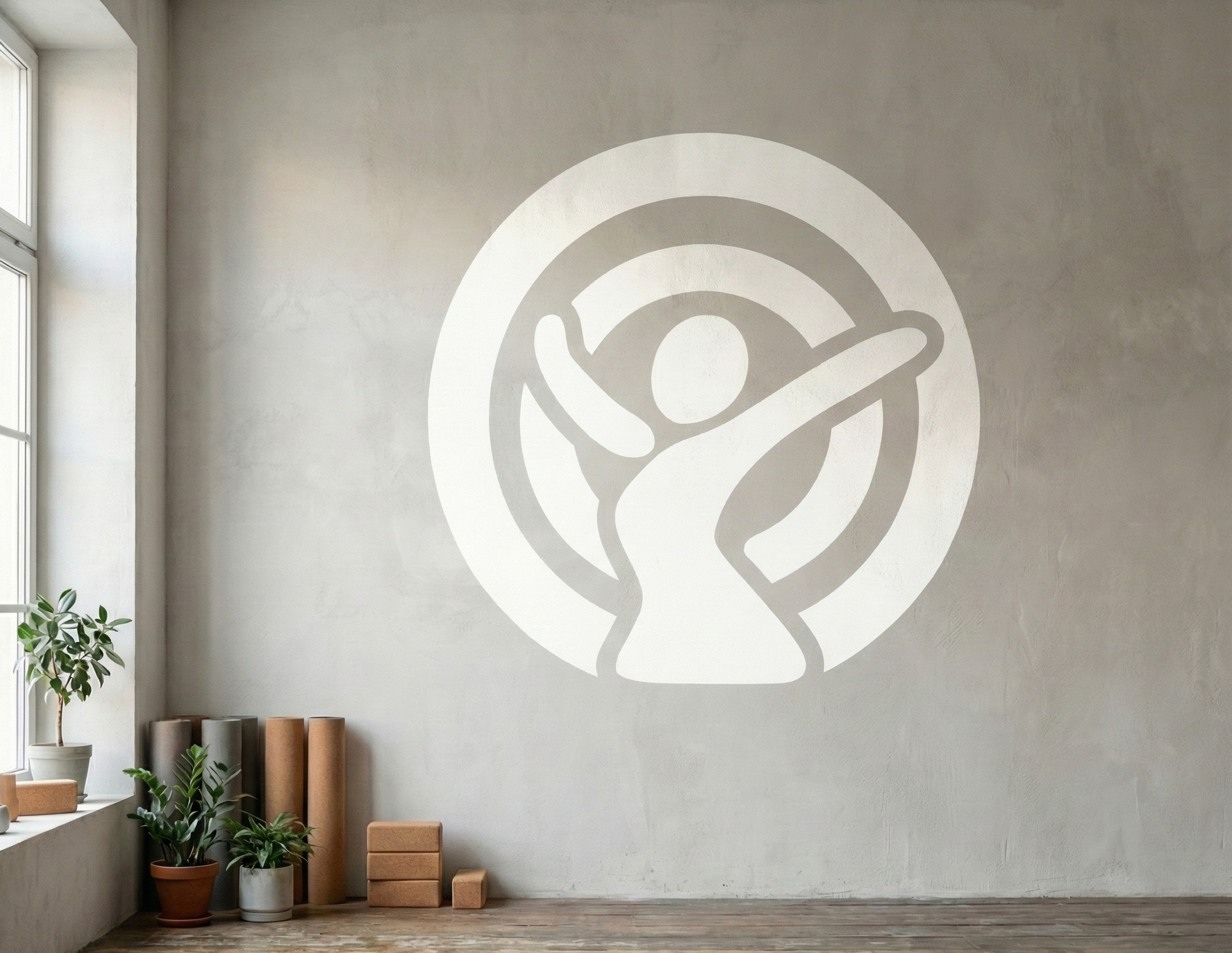
I built the logo around an abstract human figure, standing for the person within the natural world, set within a prominent circle that stands for completeness and the cycle of health.
The final mark joins the figure and the circle into one symbol, shown here on Pyrkia’s website.

Cover art and weekly posters for a campus podcast