Pyrkia Health
Background
Pyrkia Health Services is a nature-focused health program dedicated to holistic wellness. Their mission is to integrate physical health with the restorative power of the natural world to foster a sense of unity between the individual and their environment.
The Challenge
The health and wellness sector is crowded with generic imagery. The client needed a logo that was distinct yet immediately recognizable as a symbol of care and unity. It had to feel organic and human-centered without relying on clichéd health tropes.
The Solution
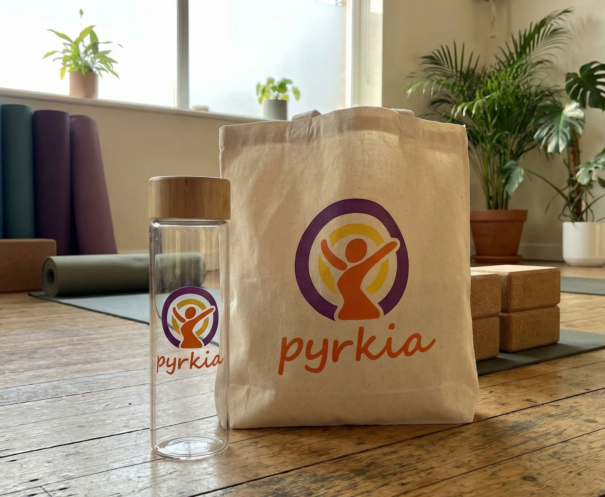
I developed the client's vision by focusing on an abstract figure that symbolizes the human element within the natural world. To reinforce the concepts of completeness and self-emphasis, I integrated this figure with a prominent abstract circle representing the cycle of health and unity.
The Result
The final design is a clean modern logo that successfully bridges the gap between professional healthcare and organic wellness. The abstract circle and figure create a memorable icon that anchors the brand's visual identity.