The Forged Group
Background
The Forged Group is a financial consultation firm based in North Carolina specializing in business consulting and human resources optimization. As a firm dealing with high-level corporate strategy, they required a brand image that conveyed strength, stability, and professional reliability to their diverse clientele.
The Challenge
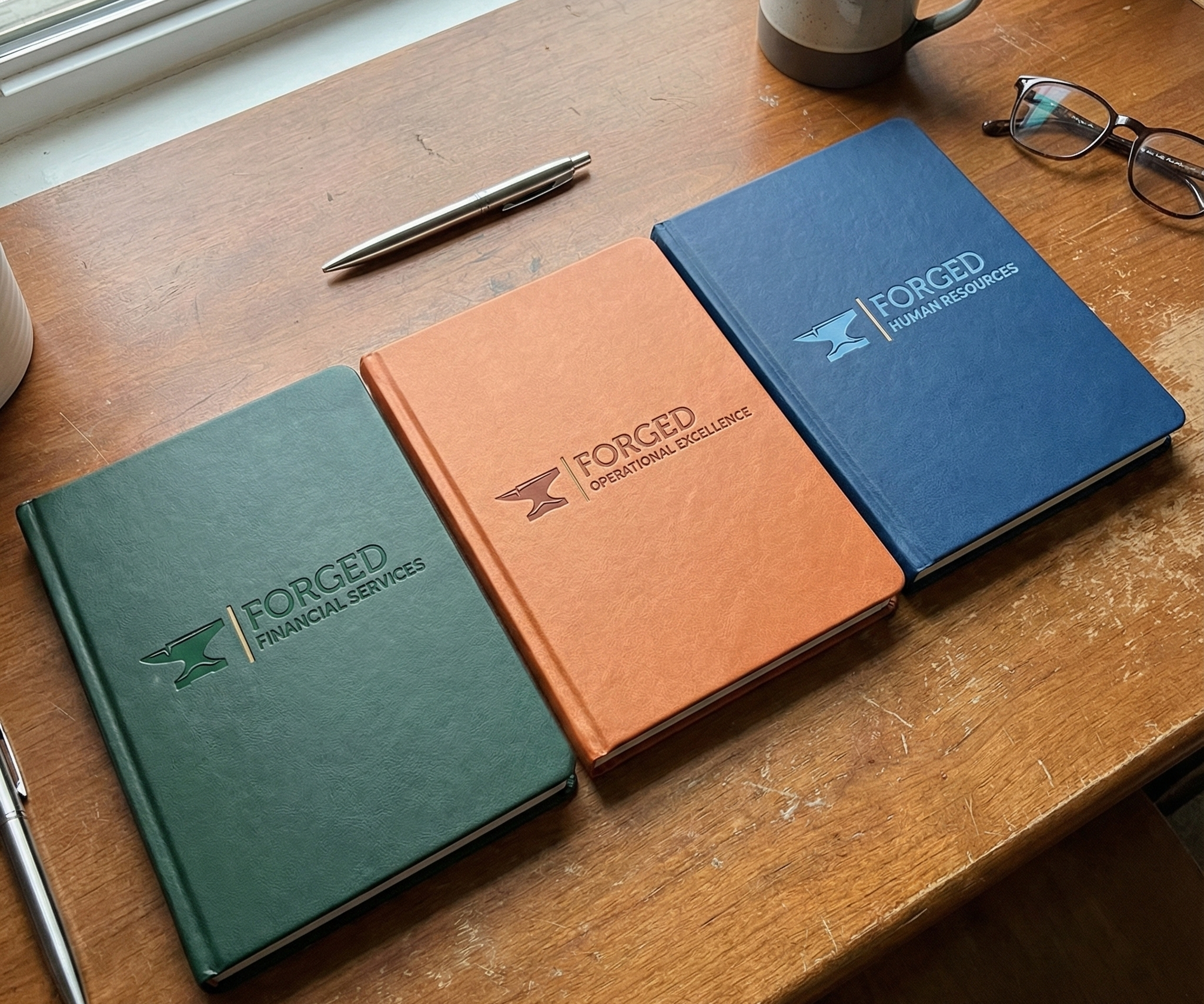
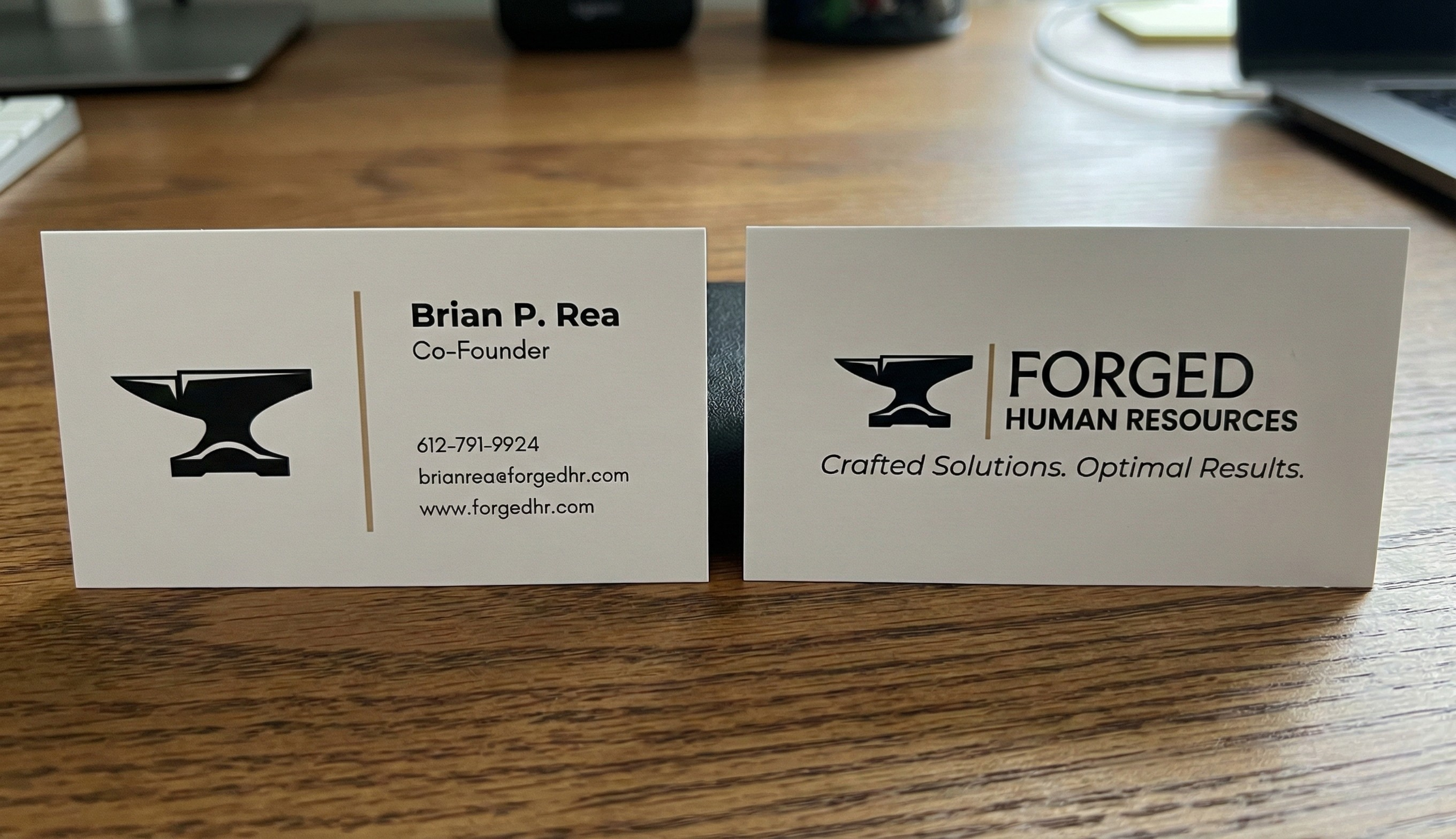
We needed to create a brand identity flexible enough to house multiple distinct sub-brands without fracturing the overall image. The system had to feel unified and monolithic while allowing each division its own clear designation on business cards and digital assets.
The Solution
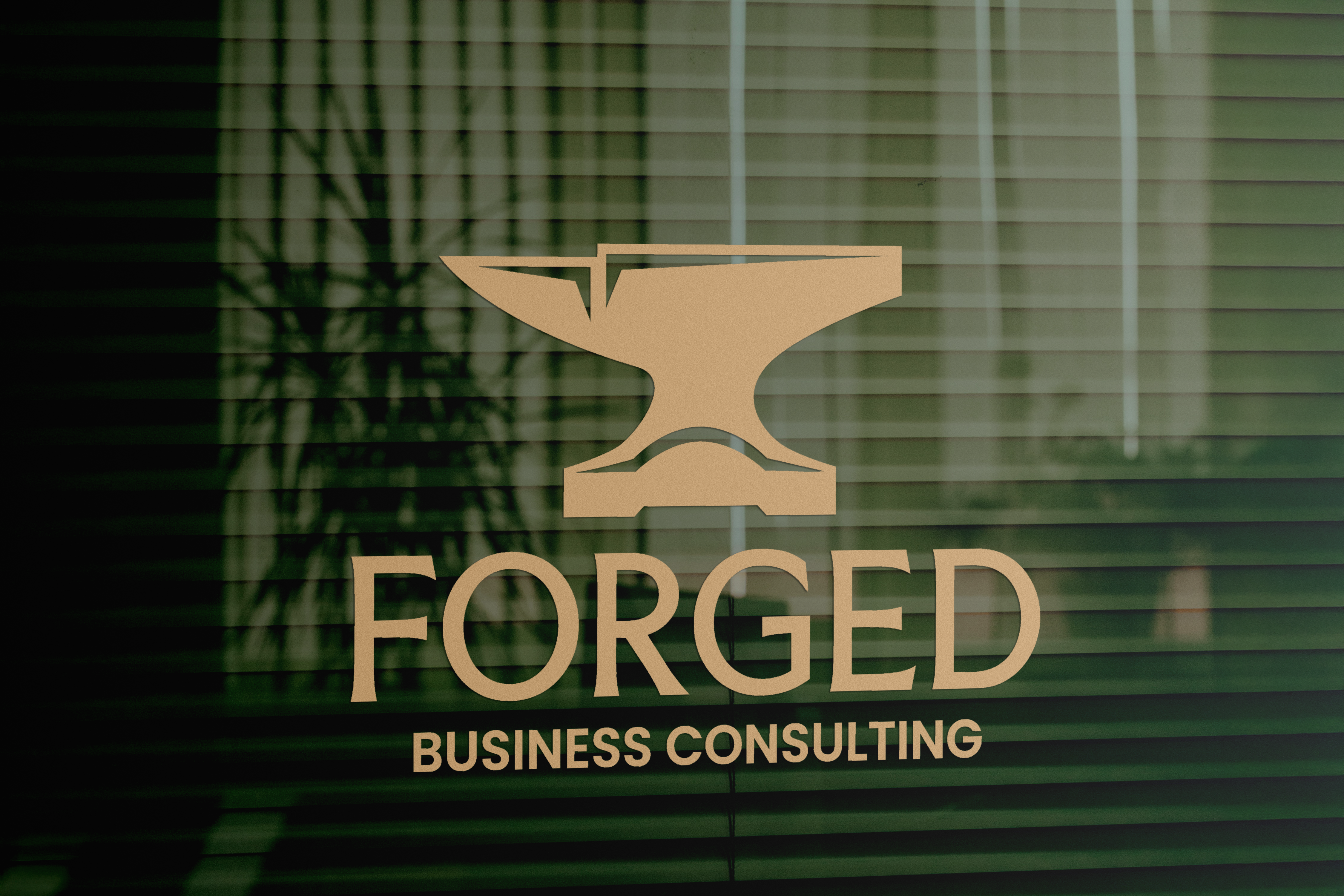
We developed a visual system anchored by a stylized anvil icon to act as a symbol of craftsmanship and durability. This icon serves as the unifying element across all collateral. A clean typographic hierarchy was established to clearly differentiate the sub-brands.
The Result
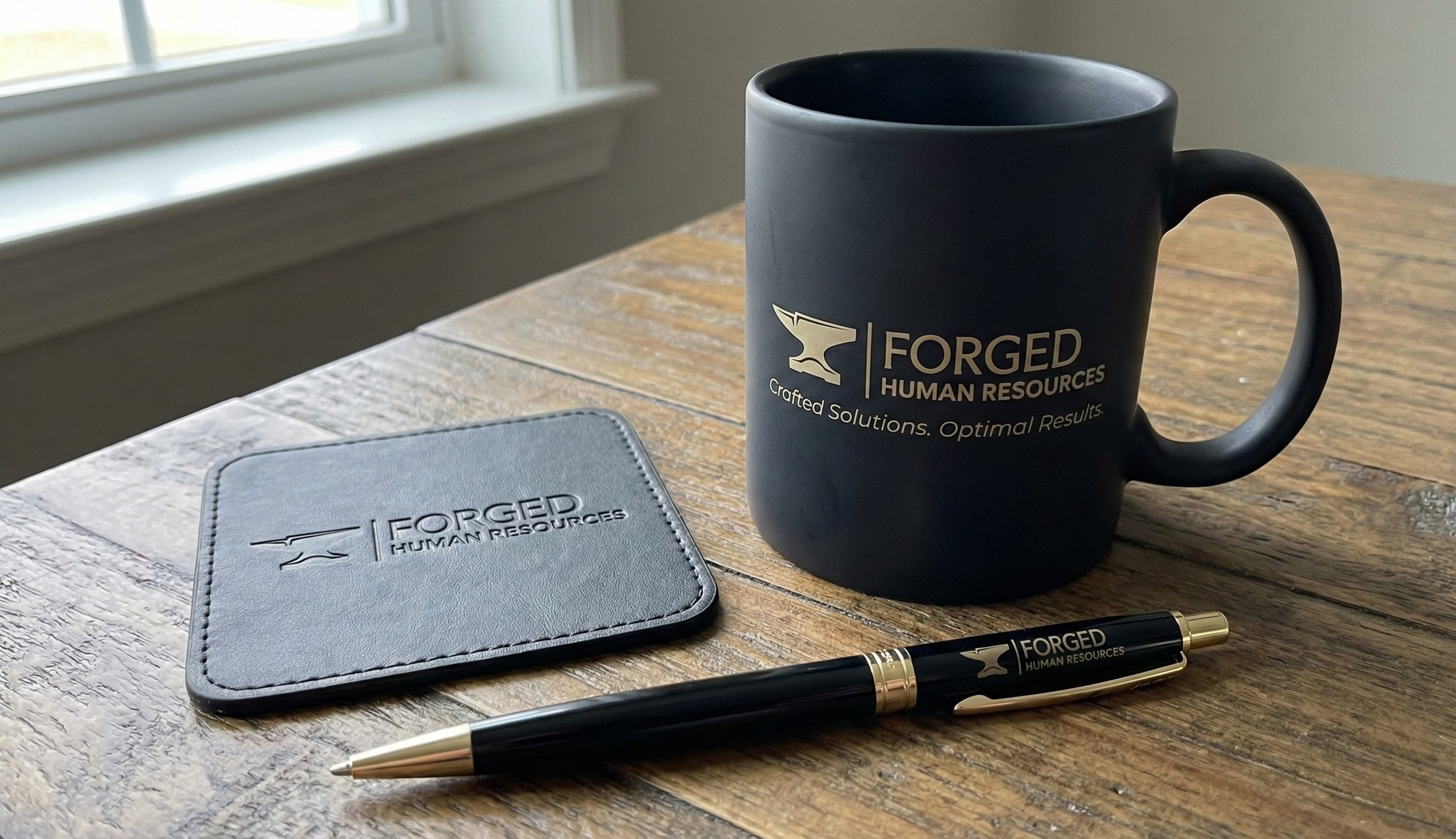
The final deliverable was a comprehensive brand identity suite including logo variations for each sub-brand along with a stationery package and merchandise assets. The result is a cohesive professional visual language that projects authority and trust.