DMARC Network Analysis
The Challenge: The DMARC Food Pantry Network generates a massive dataset of transactional visitor logs. However, the data was unstructured and lacked the demographic context needed to make informed decisions about resource allocation and new pantry locations.
The Solution: I built a reproducible data pipeline in R that cleaned raw logs, enriched them with ACS Census data, and utilized predictive modeling. This analysis provided DMARC with actionable insights into seasonal trends, shifting demographics, and geographic service gaps.
Data Standardization Pipeline
The first step involved ingesting raw transaction logs from over 90 pantry locations. I wrote a cleaning script to standardize variables, calculate visitor ages from birthdates, and bucket income levels according to Federal Poverty Guidelines. This created a universal dataset ready for downstream analysis. I calculated age against the service date rather than trusting a stored age field, since the same visitor shows up across several years of logs.
# 3c: Fixing age from DOB
data <- data %>%
  mutate(
    dob = ymd(dob),
    served_date = ymd(served_date),
    age = round(as.numeric(difftime(served_date, dob, units = "days")) / 365.25)
  ) %>%
  filter(age > -0.1, age <= 102)

# 4a: Binning Income into Federal Poverty Brackets
data <- data %>%
  mutate(
    fed_bracket = case_when(
      poverty_level == 0   ~ "0",
      poverty_level <= 25  ~ "0 - 25",
      poverty_level <= 50  ~ "25 - 50",
      poverty_level <= 100 ~ "50 - 100",
      TRUE                 ~ "Over 100"
    )
)Geographic Visit Density
I used Leaflet to map the density of repeat visitors across Central Iowa. The analysis revealed that while Des Moines proper has high engagement, reaching up to 8.2% of the population in certain zip codes, there is significant variation in the suburbs. Areas like Urbandale and Windsor Heights showed distinct utilization patterns. Zip codes with no data are labelled that way rather than drawn as zero, which would have made coverage look artificially poor.
# Create the Leaflet map
leaflet_map <- leaflet(iowa_map_data) %>%
  addPolygons(
    fillColor   = ~pal(individual_density * 100),
    color       = "grey80",
    weight      = 0.4,
    fillOpacity = 0.3,
    label = ~paste0(
      ifelse(individual_density > 0,
             sprintf("%.1f%%", individual_density * 100),
             "No Data")
    )
  ) %>%
  addProviderTiles(providers$CartoDB.Positron)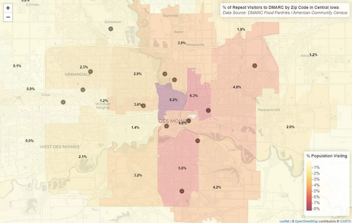
Time-Series Forecasting
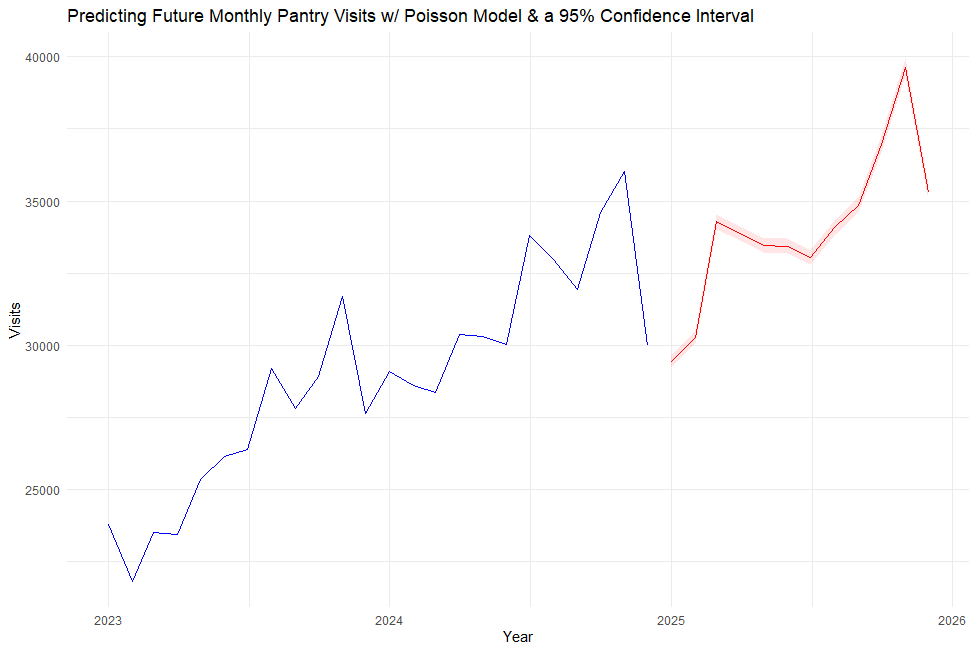
To help DMARC prepare for future demand, I developed a Poisson regression model combined with Generalized Additive Models to forecast monthly visits. The model accounts for seasonal trends and predicts a continued rise in pantry usage. It estimates a new peak of approximately 40,000 monthly visits by late 2025. I built the prediction intervals on the link scale and transformed them back afterwards, which keeps them from dipping below zero visits.
# Fit GLM with seasonal factors
glm_fit <- glm(
  total_visits ~ time_index + factor(month) + avg_age + avg_household,
  data   = monthly_data,
  family = poisson()
)

pred <- predict(glm_fit, newdata = future_df, type = "link", se.fit = TRUE)

future_df <- future_df %>%
  mutate(
    predicted_visits = exp(pred$fit),
    lower            = exp(pred$fit - 1.96 * pred$se.fit),
    upper            = exp(pred$fit + 1.96 * pred$se.fit)
  )
Analyzing Demographic Shifts
By comparing visitor data from 2018 to 2024, I identified the fastest-growing demographic groups accessing DMARC services. The data shows that Hispanic families have nearly doubled their visit share, rising from roughly 4% to 8% of the total visitor base. Both years had to be recoded onto matching ACS categories first. Otherwise, the comparison would have partly been measuring changes in how the data was recorded.
# Recode demographics for comparison
current_recode <- current %>%
  mutate(
    acs_demo_ext = paste(acs_age_group, acs_race, acs_snap,
                         acs_poverty, acs_household_structure, sep = " | ")
  )

top_growth <- type_changes %>%
  slice_max(order_by = change, n = 5)

ggplot(top_growth, aes(x = reorder(acs_demo_ext, change), y = change)) +
  geom_col() +
  coord_flip()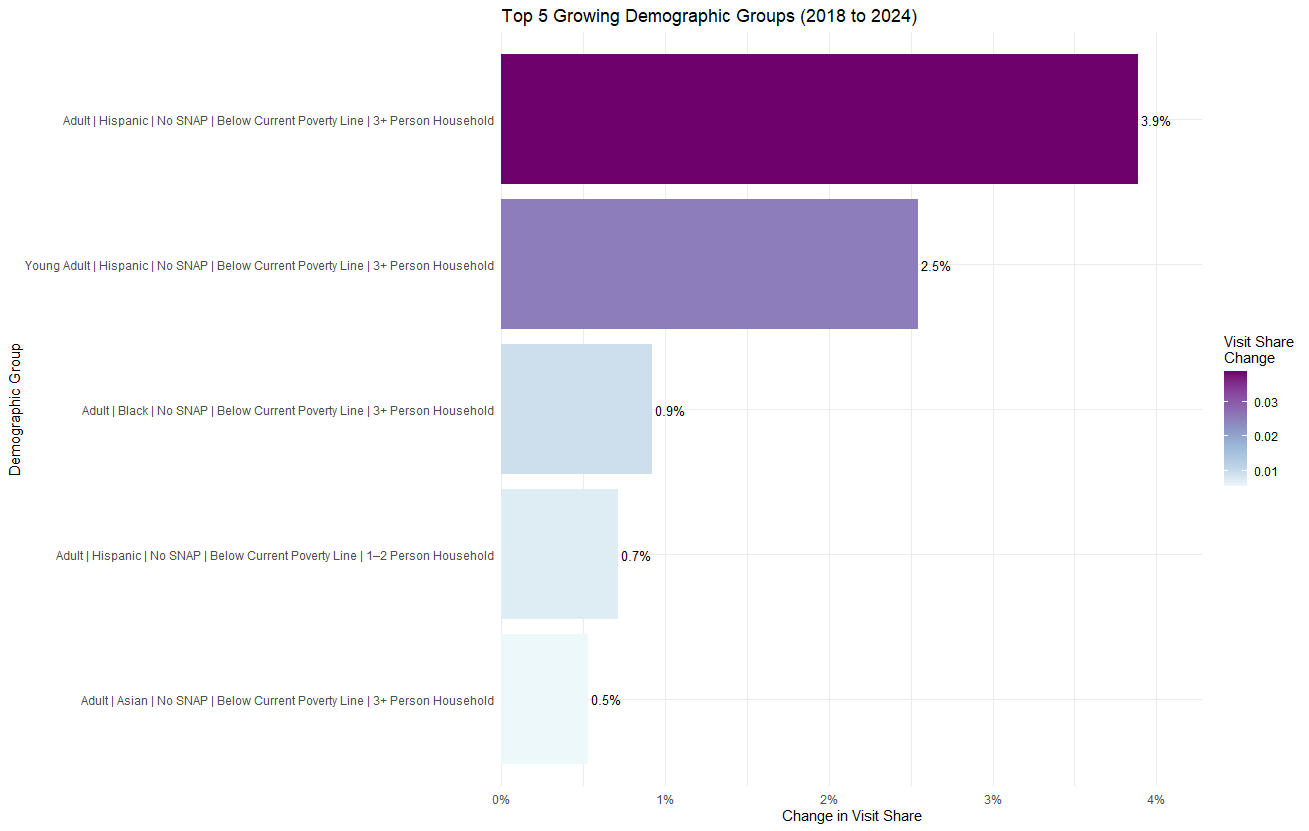
Strategic Gap Analysis
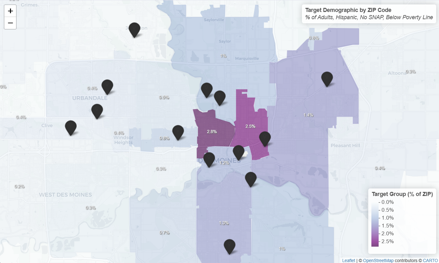
Finally, I performed a gap analysis by overlaying ACS Census data onto the pantry network map. I calculated the density of the target demographic per zip code. This revealed underserved hotspots, particularly in the River Bend area, where the target population density is high but pantry coverage is low. The density is a chain of separate proportions, which assumes those characteristics are independent within a zip code. That isn't exactly true, but the joint distribution isn't published at that level and it was enough to rank zip codes against each other.
# Calculate Target Group Density
acs <- acs %>%
  mutate(
    target_group_count = round(
      total_pop * combined_adult_prop * hispanic_prop *
      (1 - snap_rate) * poverty_rate
    ),
    target_group_density = target_group_count / total_pop
  )

iowa_map_data <- iowa_zips %>%
  left_join(acs, by = c("zip" = "ZIP")) %>%
  filter(!is.na(target_group_density))